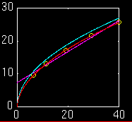

graph
of
the curves and data points
The yellow circles are the data points. The purple(ish) line is the straight line. The blue-green curve is the parabola. The red curve which intersects every data point is the "curve".
If the path of the projectile was a straight line, a straight line should fit the data best and if the path of the projectile was a parabola, an equation having the basic properties of a parabola would fit the data best.
Using linear regression, the best fits were:
y:horz dist    x:vert fall
Type graph     Equation                            Corr Coef*
straight line: y= 0.47x + 7.39                      0.9951
parabola     : y= 4.26(x^0.5)   [x=(0.235y)^2]      0.9998
curve        : y= 3.53(x^0.537) [x=(0.282y)^1.86]   0.9999
*Corr Coef = correlation coefficient : tells how closely the equation reflects the data.
I used linear regression a third time to determine exactly what type if curve would fit the data most closely. This curve is almost a parabola.
From the correlation coefficient and the graph it is obvious that the parabola fits the data much more closely than the straight line.
 Experiment
Group Home Page
written by: Sharmaine Jennings
email address:  vanese@owlnet.rice.edu
last revised: April 17, 1995